Showing posts with label album cover. Show all posts
Showing posts with label album cover. Show all posts
Saturday, 13 April 2013
Friday, 22 March 2013


Final Band website.
http://mahoneyian.wix.com/bandwebsite1
All of the images and the background I have used on my band website are taken by me by my own camera.
All of the images and the background I have used on my band website are taken by me by my own camera.
Tuesday, 26 February 2013
Meeting seven.
We originally had a plan to fim and edit on certain days, however, we have had a disruption because of a robbery, restricting us upon what we can do. Luckily we had the footage so we will have to re-edit the music video as soon as possible. On top of this, we still have to film other scenes for the main singer and the band perfromances. In the meantime we are also going to work on our website and individual Digipaks and start to film and edit in the avalible times that we have got.


Wednesday, 20 February 2013


Tuesday, 12 February 2013
Album advertisement analysis.

This is an album advertisement for Kings of Leon and their album Only By The Night. The advert gives an overall impression of the band which is a rock/alternative image. Unlike most boy-bands, who use bright colours, this band have gone for a more moody and dark image rather than a bright and cheesy image. This is also to reflect on the sound of their music and the kind of impression that they want to portray to audiences.
The advert, has the album cover on as the main and only image to make it recognisable to audiences who will remember the poster and album cover, thus buying their album. It also has an artistic vibe to it which is part of each member in each quarter of the image, this is blended in with an image of a Bald Eagle. This could represent the band all together or it could reflect upon the lyrics in some of their songs.
All around the main image of the advertisement are essential information about the album such as the name and artist. The font is like a typewriter and this gives us an impression that the target audience is more young adults and above rather than young children. It shows hit singles that the audience will recognise and therefore will buy the album. The 'out now' is in red as an alert and something that will catch the audiences eye and so will buy the album.
Friday, 1 February 2013
Digipak designs.


Tuesday, 22 January 2013
Digipak analysis two.

Tuesday, 18 December 2012
Sunday, 16 December 2012
Research on bands albums and ideas for Digipak. (wip)
The Ordinary Boys.

Lady Sovereign.

Here are some ideas of mine for the Digipak in promotion for the band. I have taken photos on location and drawing as of what I would like to have on my Digipak. For the photos I have taken on location I have decided to use different effects available on photoshop to make it more relatable to the artists image.


Tuesday, 6 November 2012
Album Artwork
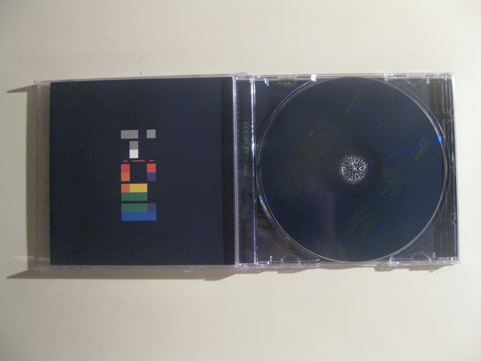
Some albums have very artistic and creative covers to draw attention to the creativity of that artist. Some may relate to the songs in the album and others may portray the type of music the artists makes. Coldplay have set a theme of colourful and graffiti artwork which can reflect moods of the songs, it also gives it a young and urban look to appeal to younger audiences.


Female artist either portray their artwork through an artistic, fashionable or revealing way. For Example Rihanna shows an edgy look because of the sharp ‘R’ symbol and her facial expression, this is important as her look has to be appealing particularly as she is a worldwide superstar. Male artists such as Ed Sheeran may use a simple portrait with artistic effects to make it stand out like the oranges used.
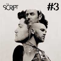
Different girl-bands and boy-bands also portray different looks and statements that they want to hold. The Saturdays show more of a girly look which matches with the image of the cover and this attracts wider audiences giving a typical pop music look. But some bands like The Script show a more artistic look as they have a silhouette of the main member of the band and the other two members are cleverly photographed onto the silhouette.


Monday, 8 October 2012
Album covers and designs.


Here are some examples of album covers and packs from a variety of artists. As you can see some have 'exclusive' pictures of individual members or the artist such as The Wanted and Hilary Duff. This will make the audience want to buy these deluxe albums because of the extra stuff that comes with it. For example extra pictures in The Wanted album. Also they may feel as though the album is more personalised to the fans as they get extra things with it unlike most album packs.
Other albums like Coldplay are more focused on the artwork and photography of the album and the band rather than the lyrics. This makes it more appealing to older audiences as it's not as cheesy as other albums of different bands.
Pixie Lott's album however, has lyrics and pictures in the album covers which means that fans can look up the lyrics and relate to them. Her album also has very bright and appealing which attracts the right audience wich would mainly consist of teens, by means the album would have to be girly.
Subscribe to:
Posts (Atom)